The Best Way to Use Colors in Your Landscape Photography
Dec 03, 2022
Colors play a huge role in your landscape photography; understanding them is how you can use them best in your photos.
Did you know that you can actually make your landscape photography better by pairing specific colors together in your photos?
Let's take it a step further.
Did you know you could affect how your viewers feel when they look at the colors in your photos?
There is actually a lot of scientific research behind understanding how our brains interact with color and how they connect colors to emotions.
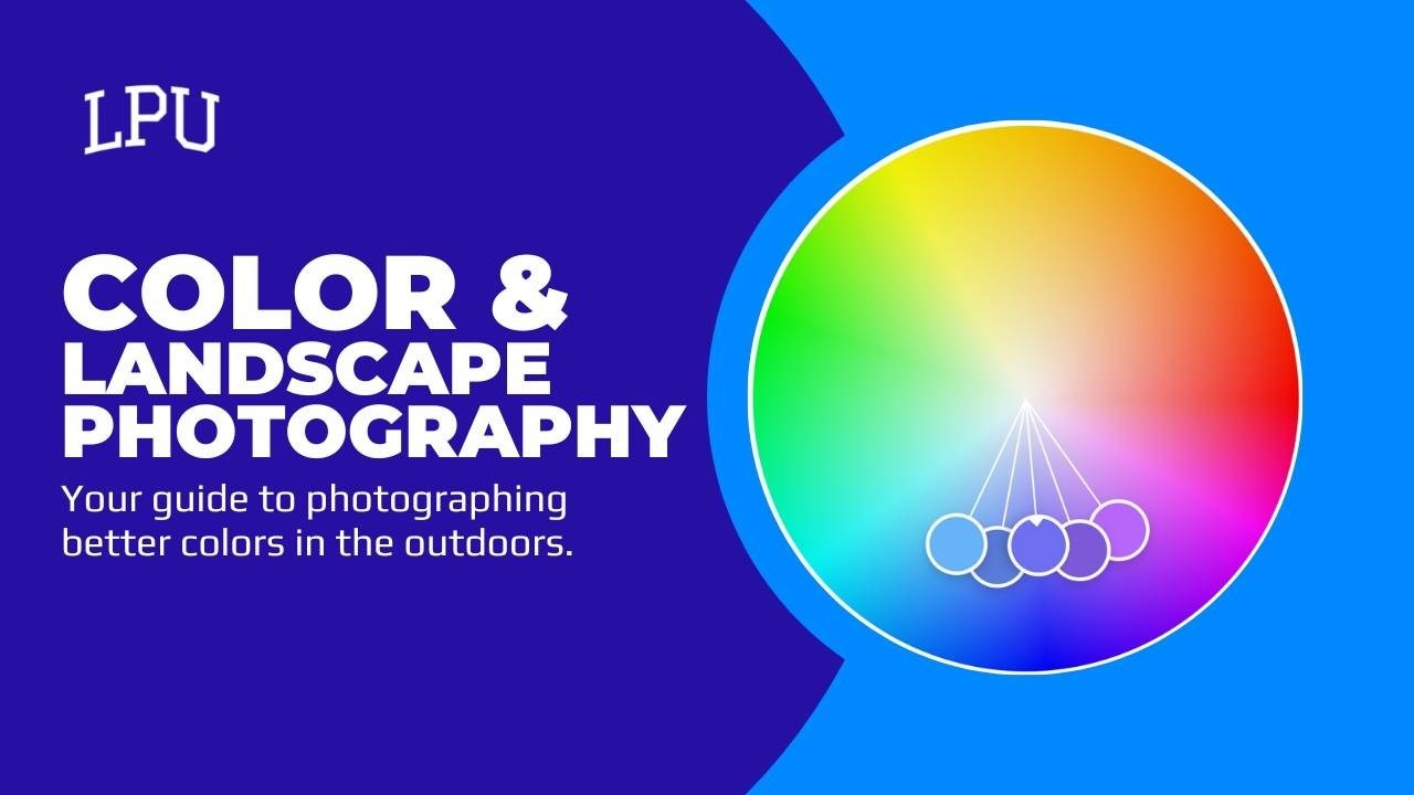
The first step to understanding color and landscape photography is understanding the color wheel.
The color wheel shows an organized representation of color values based on letters and numbers. You don't have to understand the organization, but you should understand how they work together.
How Colors Close to Each Other Work
Colors that are close to each other on the color wheel are called analogous colors. They are similar in color tone and appear across a large area of the wheel itself.
The photo above shows a representation of a green analogous spectrum of colors on a color wheel that was generated randomly.
As you can see, all of the colors are close to and similar to the mid-range green color (labeled "C") on the wheel.
When colors are close to each other on the color wheel, they make your viewer feel peaceful. Similar color pallets have been shown to cause a calming effect on the person and the mind.
If you go to a hospital or doctor's office, you might notice that many of the photos hanging have a very analogous feel to them. This is to help the patients feel calm while they are under medical care. Some studies show that these kinds of color representations can even have healing effects on people.
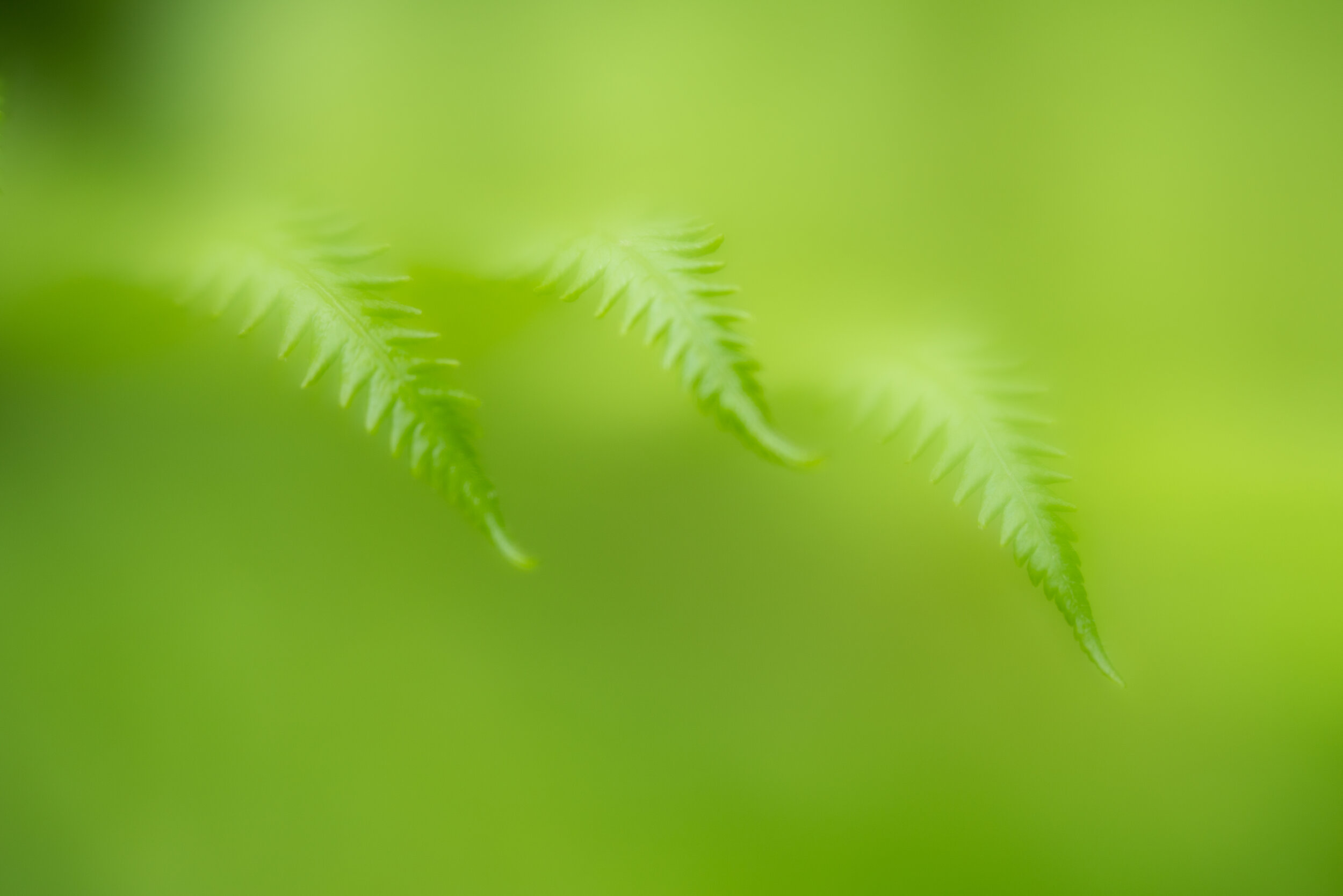
In this photo example, you can see that many of the same colors apply. It's very green. I would ask you, how do you feel when looking at this photo? Does it have a calming quality to it?
That's because it has used the analogous principles of color!
How Colors Opposite One Another Work
So, we talked about colors that are close to each other on the color wheel, but what about those colors on completely opposite sides of the wheel?
Colors that are opposite one another are called complimentary colors.
When I chose the complimentary option on the color wheel and selected yellow, it gave me the complete opposite color purple as its complement.
No matter what color you are using, the opposite side of the color wheel will be its complementary color.
Like analogous colors, complementary colors can impact the viewer's emotions too. Since they are such drastically different colors, complementary colors make your viewer feel excited and often get them to take a specific action.
If you think about the most liked photos on social media, they will often have complementary colors present to excite the viewer to take action. In that case, like the photo.
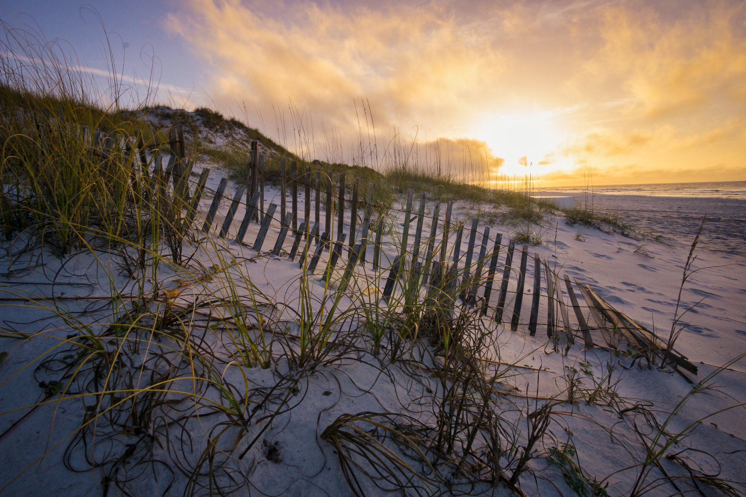
This photo shows the purple and yellow combination of complementary colors in action. The purple tones of the sand and the bright yellow sunrise pair for an exciting sunrise. If I share this photo online, it's almost guaranteed to elicit more results.
While colors are great and can be used, you must learn how they are to be used. Landscape photographers often have no control over what colors will be present, so we have to react to what is given to us.
Now that you know how to use analogous and complementary colors in your landscape photography, you will begin taking more dynamic photos.


